Herbie Regime Testing Update 1
One of the aspects lacking in the graphs of the previous post was more detailed information on how well Herbie does compared to the optimal regimes. After running some more regime tests on the Compound Interest expression, I now have some graphs that better illustrate this property.

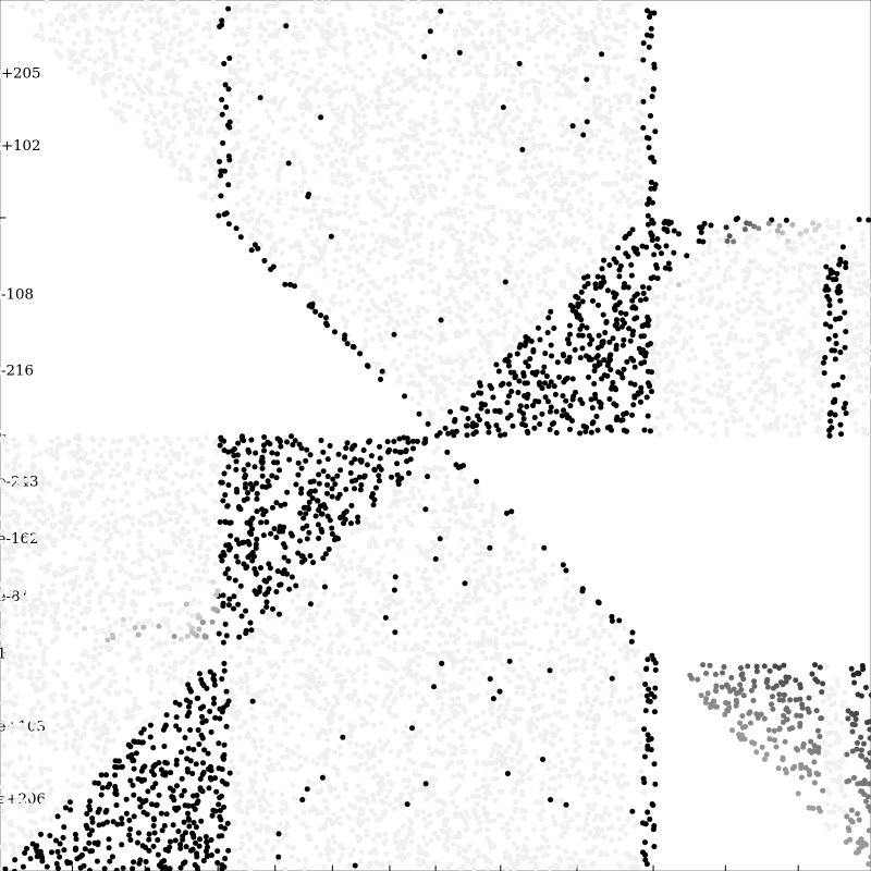
This graph plots each resampled point (\(i\) vs \(n\)) in greyscale as a function of Herbie’s percentage improvement defined by
\(\texttt{herbie \% improvement } = \frac{\texttt{baseline err } - \texttt{ herbie err}}{\texttt{span}}\) where \(\texttt{span } = \texttt{baseline err } = \texttt{ oracle err}\)
The darker points are the those where the Herbie % improvement is low, and there is a minimum darkness to make all the points visible.
There are a few interesting things about this graph, most notably, the three triangular regions that Herbie does particularly badly. The areas very close to the branch condition also have a low Herbie % improvement, and there is an interesting banding effect near the right side of the graph. The three triangular regions are the first things to look at moving forward, as they constitute the largest source of error.
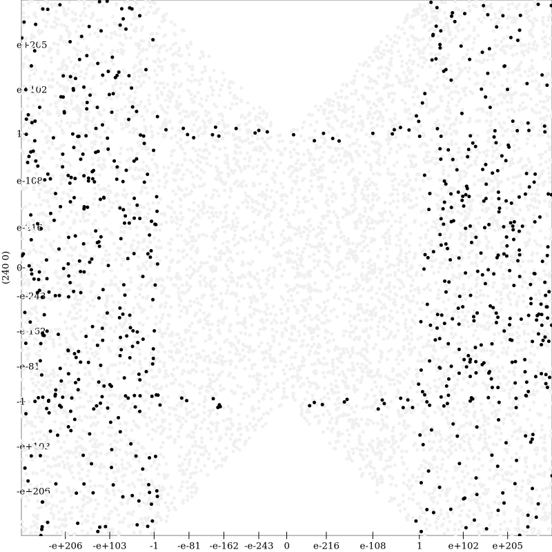
It should be noted that the graph shouldn’t just be taken by itself, as there is currently no indication of how many bits of error this percent improvement makes up. The Compound Interest expressions has span of \(17.40\) bits. Compare this to this expression which has a span of only \(0.12\) bits and the following graph.

Despite the significant number of points where the oracle does better than Herbie on, there is little to be gained by further improving Herbie’s regimes for this specific example.